The 60-30-10 color rule is probably one of the first interior design rules you’ll come across when you start thinking seriously about color and design.
And I completely understand why it’s so popular. It’s simple, memorable, and gives you somewhere to start.
But when I first tried applying it to actual rooms, I had one pretty major question:
What if my room has more than three colors?!
Because mine definitely do… just take a look on my house tour.
Once you count the wood furniture, flooring, metal finishes, patterned rugs, artwork, upholstery, and all the smaller colors sprinkled throughout a room, suddenly trying to divide everything neatly into 60%, 30%, and 10% doesn’t feel quite so straightforward.
As someone who has been passionate about interior design for over a decade, this was pretty frustrating to not understand a “universal” interior design rule.
The good news is that I don’t think you need to think about the 60-30-10 rule so strictly.
I think the 60-30-10 rule works best as a lesson in color hierarchy, not a mathematical formula. Once I started looking at it that way, the rule became much more useful—and it also helped me understand why so many beautiful rooms break it completely. My favorite designers do all the time!
What Is the 60-30-10 Color Rule?
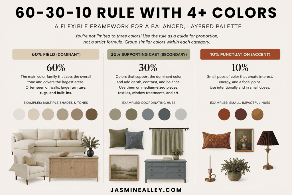
The 60-30-10 color rule is an interior design guideline that divides a room’s color palette into three proportions:
- 60% dominant color: The main color that establishes the overall atmosphere of the room. This might appear on walls, a large rug, cabinetry, or major upholstery.
- 30% secondary color: A supporting color that creates contrast or variation while still occupying a meaningful amount of visual space.
- 10% accent color: A smaller dose of color used to create interest, contrast, or a focal point.
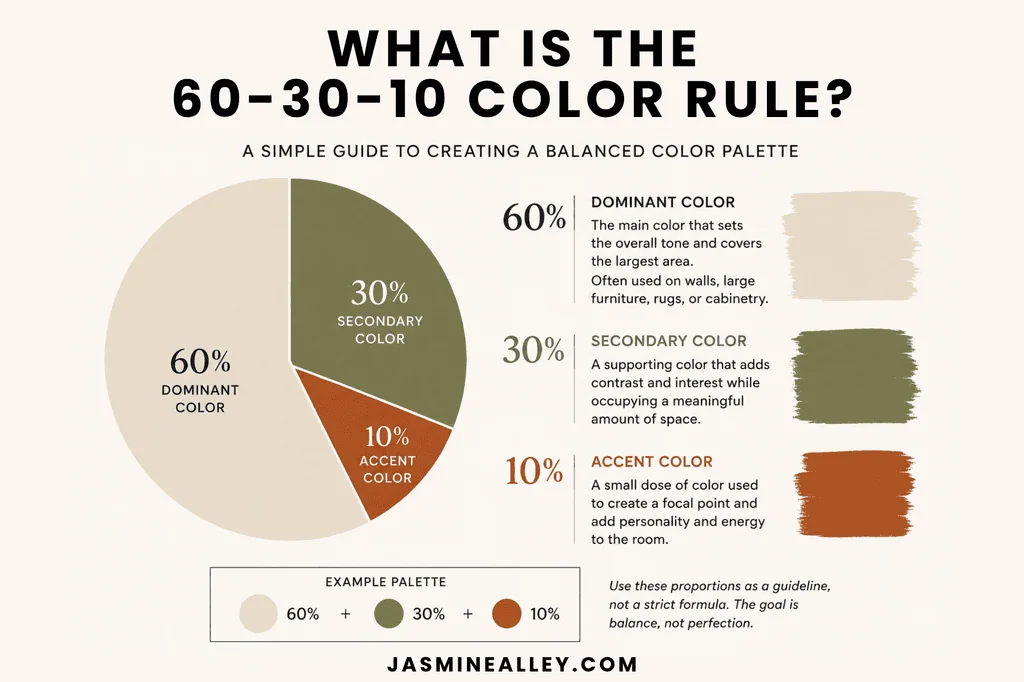
A classic example might be:
60% warm cream + 30% olive green + 10% rust
The idea isn’t that you need to calculate the square footage of every colored surface in your room. It’s simply a guideline for creating a palette in which one color dominates, another supports it, and a third provides contrast. And that part of the rule is incredibly useful.
Why Does the 60-30-10 Rule Work?
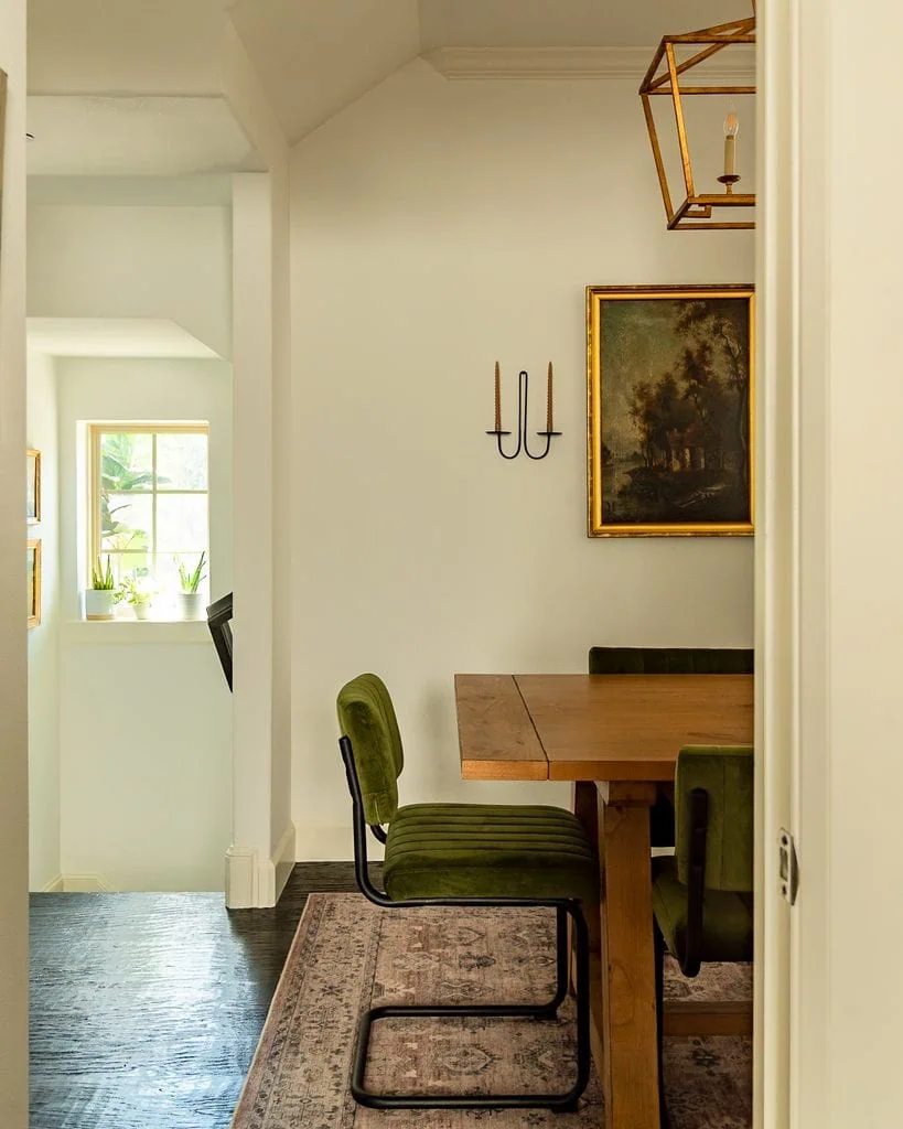
The genius of the 60-30-10 rule isn’t actually the numbers.
It’s hierarchy.
Imagine a room where cream, green, blue, pink, and yellow all appear in roughly equal amounts and with roughly equal intensity. Your eye doesn’t necessarily know which color is supposed to lead.
Now imagine that same palette organized differently:
Cream dominates. Green appears throughout the room. Blue and pink show up in smaller amounts. Yellow appears once in one surprising little object.
Same general palette. Completely different effect. One color has authority, some colors play supporting roles, and another acts almost like punctuation.
That’s what I think the 60-30-10 rule is really trying to teach.
A room doesn’t need three colors. It needs unequal color roles.
Once you understand that, you can use four colors, seven colors, or twelve colors without necessarily making the room feel chaotic.
Where the 60-30-10 Color Rule Starts to Break Down
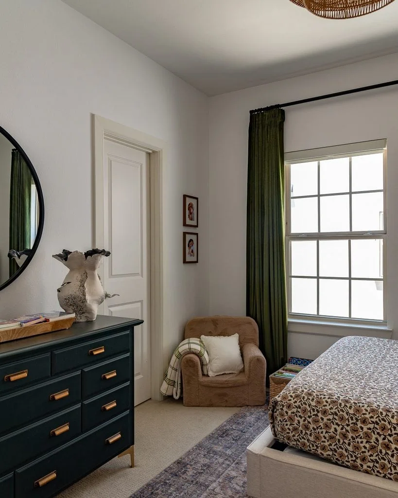
The more I’ve studied color in interiors, the less interested I’ve become in whether a room technically follows 60-30-10.
My favorite interior designers like Heidi Caillier and Beata Heuman rarely limit their rooms to three colors. Real rooms are simply more complicated than three percentages suggest.
Here are four reasons I wouldn’t follow the rule too literally.
1. It Doesn’t Account for Visual Weight
Ten percent of one color isn’t necessarily visually equivalent to 10% of another.
Imagine a room with pale cream walls and one tiny burgundy lampshade.
The cream obviously occupies much more physical space. But your eye might still go straight to the lampshade because dark, saturated colors tend to carry more visual weight than pale, muted ones.
The same thing happens with a tiny cobalt vase, tomato-red pillow, dark green chair, or black picture frame.
This is why I think counting physical color percentages can be misleading.
Sometimes 2% of a powerful color can feel like 10%.
2. It Doesn’t Really Explain What to Do With Wood and Metal
This was one of the things that originally confused me most.
Say I have:
Cream walls + green upholstery + blue curtains.
Perfect. Three colors.
But then there’s a walnut dresser. And brass lighting. And a faded multicolored rug.
Is walnut part of the 60%? Does brass count toward the 10%? Do I ignore them because they’re considered “neutrals”?
I don’t think you should.
Wood and metal are colors.
Walnut contributes brown. Mahogany may contribute red. White oak can contribute yellow. Brass adds warm yellow-gold, bronze can function like deep brown or black, and polished nickel contributes a cooler silvery note.
Ignoring those finishes means ignoring colors that may have a huge impact on the room.
3. Pattern Makes the Math Almost Impossible
Now add a patterned rug.
Maybe it contains:
Cream + dusty blue + rust + olive + burgundy + brown.
Which percentage does that belong to?
You could technically identify its dominant color and try to assign every other color to your remaining percentages, but at some point you’re doing an awful lot of math for something your eye can usually understand much more intuitively.
Patterns are actually one of my favorite ways to make a complicated color palette work because they give your eye evidence that several colors belong together.
A rug containing blue, rust, olive, and pink can make those same colors feel completely natural elsewhere in the room.
Trying to force that into three color buckets can make a layered room harder—not easier—to understand.
4. The 10% Accent Can Become Too Predictable
This is probably my biggest issue with applying the rule too literally.
You choose your dominant neutral. Then your secondary color. Then you select an “accent color” and dutifully repeat it in a pillow, vase, artwork, and throw.
Everything coordinates.
And sometimes that’s exactly the problem.
Some of my favorite rooms contain a color that appears once.
- A cherry-red lampshade.
- An acid yellow-green ceramic.
- A cobalt vase.
- A strange little pink picture frame.
That color isn’t necessarily the room’s designated 10%. It might not even be repeated anywhere else.
It’s there because the room needed a little tension.
And sometimes repeating that unexpected color three or four times would actually make it less interesting.
But What If My Room Has More Than Three Colors?
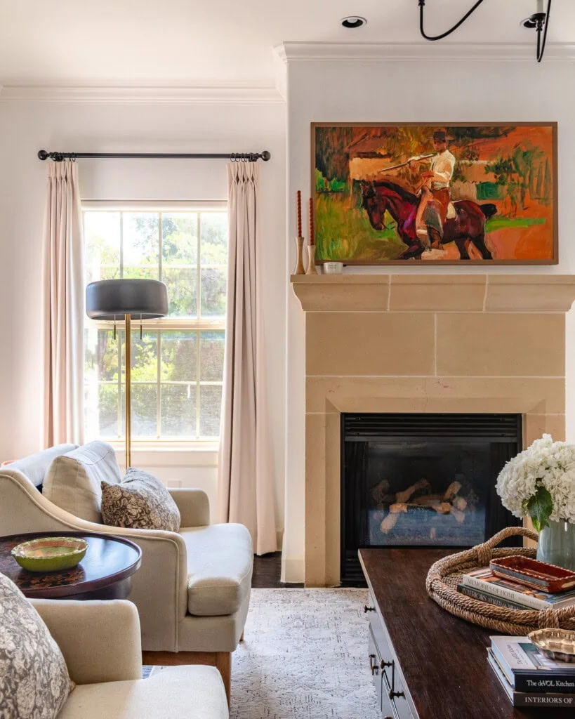
You can absolutely use the 60-30-10 rule with four or more colors.
This is where I think people get unnecessarily hung up on the numbers.
You don’t need to turn 60-30-10 into 60-20-10-5-3-2 just because your rug has burgundy in it.
Instead, group colors according to the role they’re playing in the room.
For example, imagine a room containing cream, brown, olive, dusty blue, burgundy, brass, and pale pink.
Rather than assigning a percentage to every hue, you could think of it like this:
- Dominant atmosphere: warm cream and brown
- Major supporting color: olive
- Secondary supporting colors: dusty blue and pale pink
- Small accents: burgundy and brass
That’s still the logic of 60-30-10.
It just isn’t literally three colors.
In fact, I think this is one of the biggest misconceptions about the rule: a “color” category doesn’t necessarily have to mean one exact hue.
Several related neutrals might collectively create your dominant 60%. Multiple supporting hues might occupy the middle of the hierarchy. And your smallest colors don’t have to add up neatly to exactly 10%.
Think hierarchy, not pie chart.
What I Use Instead: Field, Supporting Cast, and Punctuation

In my larger guide to color theory in interior design, I talk about a framework I find much easier to apply to real rooms:
Field + supporting cast + punctuation.
It’s essentially what I think the 60-30-10 rule is trying to accomplish, without forcing a complicated room into three exact colors.
Field
The field is the overall color atmosphere of the room.
It usually comes from the largest surfaces and repeated tones: walls, flooring, rugs, cabinetry, large upholstery, and sometimes wood.
A room’s field might be:
- warm and creamy
- earthy and brown
- pale and cool
- predominantly green
- dark and enveloping
You don’t necessarily need to reduce it to one paint-chip color.
Supporting Cast
The supporting cast includes colors that appear in meaningful amounts but don’t control the entire room.
These might come from:
- curtains
- furniture
- wood tones
- bedding
- rugs
- artwork
- stone
- patterned textiles
You can have several supporting colors.
The important thing is that they don’t all need equal authority.
Punctuation
Then comes my favorite category: punctuation.
These are the small, visually powerful colors that make you look twice.
Think:
- tomato-red lampshade
- cobalt vase
- oxblood pillow
- chartreuse ceramic
- tiny bit of lavender in a rug
Punctuation doesn’t necessarily need to be repeated.
In fact, sometimes it works because it isn’t.
If traditional 60-30-10 says, “Here are your three colors,” I think field + supporting cast + punctuation asks a better question: What job is each color doing?
What Does the 60-30-10 Rule Look Like in a Real Room?
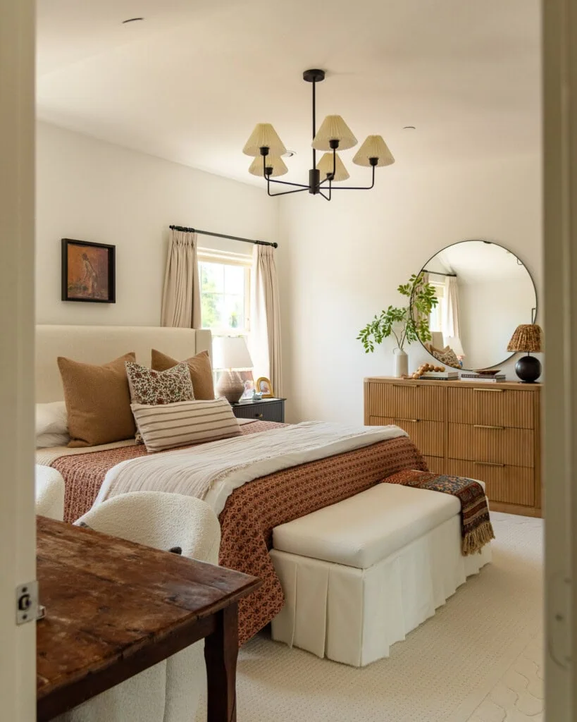
This is where things get interesting, because actual rooms rarely divide themselves into a perfect pie chart.
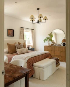
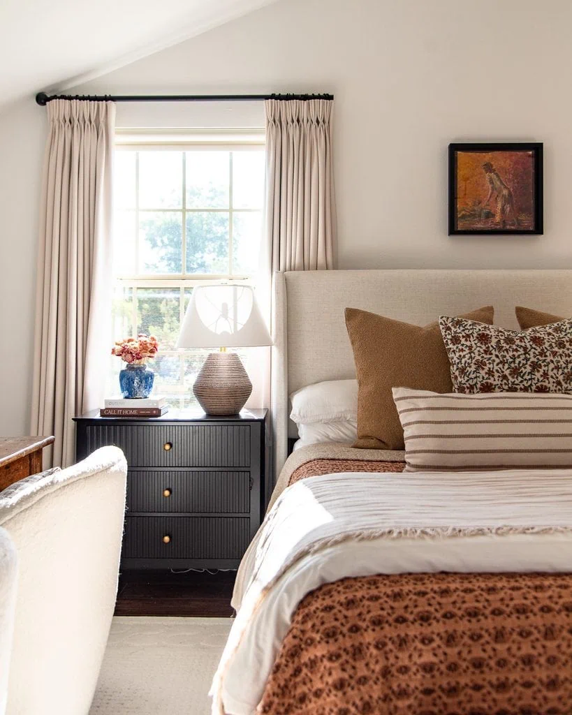
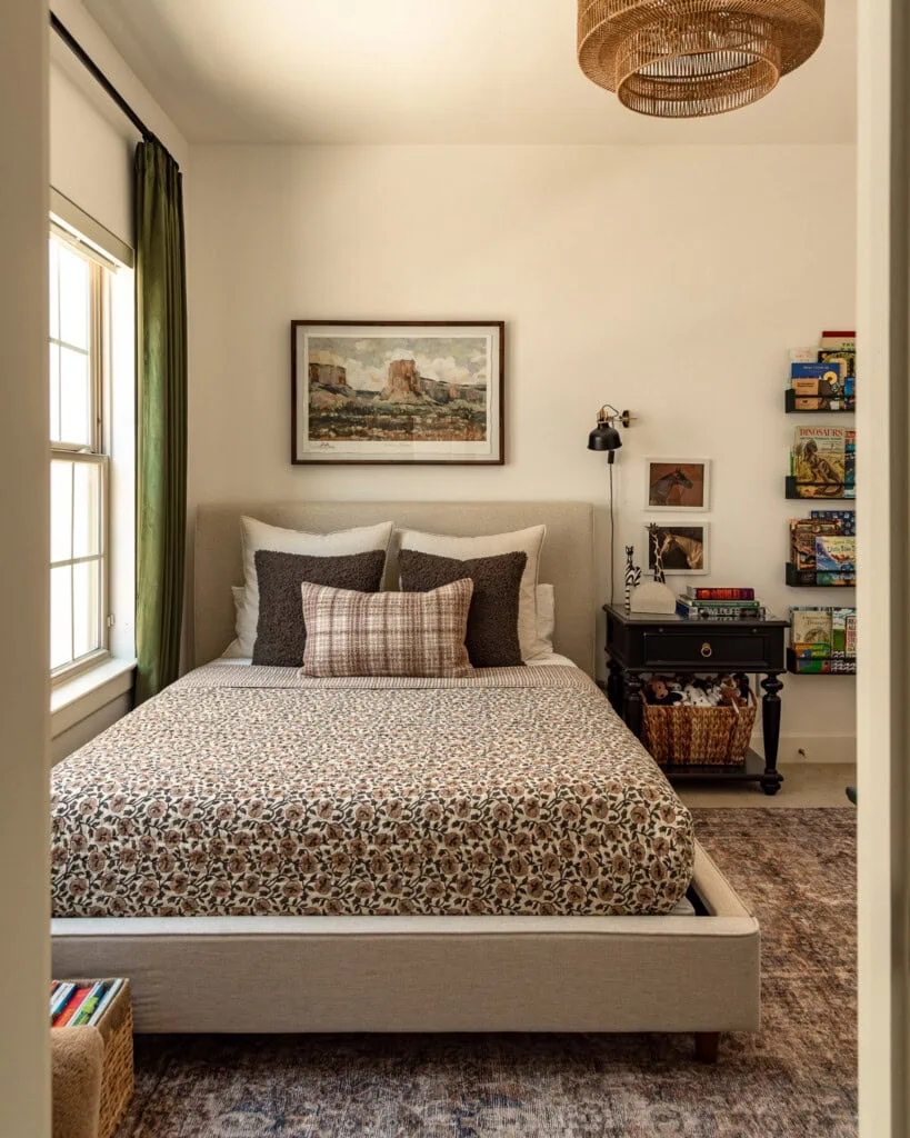
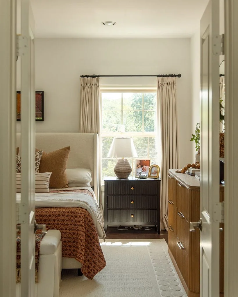
Take my bedroom. At first glance, you could probably force it into a 60-30-10 formula: cream as the dominant color, terracotta as the secondary color, and brown as the accent. But once I count the wood furniture, black nightstands, brass hardware, patterned textiles, artwork, and all of the smaller colors within them, that breakdown falls apart pretty quickly.
Instead, I think of the room as having a warm cream field, with a supporting cast of terracotta, tobacco, camel, brown, and warm wood tones. Then there are much smaller notes of black, brass, blue, green, and deeper rust that provide contrast and punctuation.
And those tiny colors don’t necessarily have tiny visual impact. The black nightstands, for example, occupy relatively little space but provide some of the strongest value contrast in the room, while the small blue accents introduce cool relief against an overwhelmingly warm palette.
That’s why I’d rather analyze what each color is contributing to a room than worry about whether my percentages add up perfectly.
Here’s Another Room That Breaks the 60-30-10 Rule
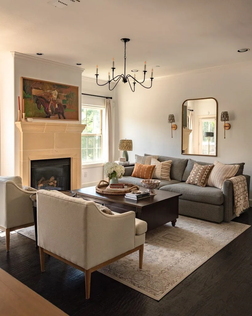
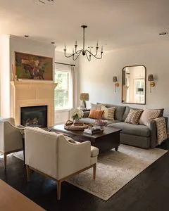
If I tried to reduce my living room to three colors, I’d lose a huge part of what makes the palette work.
There’s cream, gray-blue, chocolate brown, warm limestone, rust, olive green, blue-green, black, brass, and several shades of natural wood—and that’s before counting all of the individual colors within the painting, pillows, rug, and smaller accessories.
There are clearly more than three colors, but they aren’t competing equally.
The cream walls, pale rug, and cream chairs create the dominant field, while the gray-blue sofa acts as a large supporting color. Dark brown wood and the nearly black floors ground all of those lighter colors, while the warm limestone fireplace bridges the creams and browns. The painting then brings in much stronger rust, green, burgundy, and orange tones without requiring me to repeat every one of them around the room.
Smaller moments of blue-green, rust, brass, and olive add color punctuation, while the black chandelier, curtain rods, and fireplace insert provide some of the darkest values in the room. There is also a constant push and pull between warm and cool: the limestone, wood, rust, and brass are balanced by the cooler sofa and blue-green accents.
That’s the distinction I care about.
Color complexity isn’t the same thing as color chaos.
You can use lots of colors as long as your eye can still understand the hierarchy.
The Time I Followed 60-30-10 Too Literally
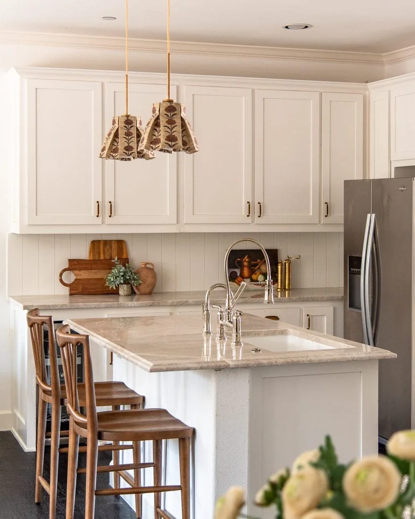
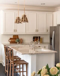
My kitchen is probably the closest I’ve come to decorating according to the 60-30-10 rule without intentionally setting out to do it.
The room has a very clear hierarchy: warm white and cream dominate, brown wood acts as the secondary color, and smaller doses of brass, terracotta, green, and pattern provide the accents.
And I like my kitchen! But looking at it through the lens of color theory helped me understand why I’ve sometimes felt like it was missing something. The palette is almost too cooperative. The warm whites relate to the warm stone, which relates to the brown wood, which relates to the brass and terracotta. Everything makes sense.
What it doesn’t have much of is color tension.
If I approached this room today, I wouldn’t necessarily add more of an existing accent color just to repeat it around the room. I’d be much more interested in introducing one small color that feels slightly unexpected—probably something cooler or a little more saturated—to interrupt all of that warmth.
I also have plans to shift the larger color hierarchy itself. I’m planning to paint the perimeter cabinets a creamy greige and the island SW Sand Trap, a muddier taupe-brown. That will give the room more tonal variation and depth instead of having so much of it read as one continuous field of white and cream.
This is actually part of why I stopped thinking of accent colors as something that always needs to be repeated throughout a room.
Sometimes a palette doesn’t need another matching accessory. Sometimes it needs the exact opposite: one thing that disrupts the pattern.
When Should You Actually Follow the 60-30-10 Rule?
After spending most of this article telling you why I don’t follow it literally, I want to make one thing clear:
I don’t think the 60-30-10 rule is a bad rule.
I think it’s a very good beginner’s framework.
I’d be especially likely to use it if:
- You’re decorating your first home and feel overwhelmed by color.
- You’re refreshing one room rather than building a layered palette over time.
- You’re a renter working mostly with furniture, textiles, and accessories.
- You tend to buy lots of unrelated colorful things and struggle to make the room feel cohesive.
- You want a simple formula for choosing a dominant, secondary, and accent color.
For example, if you have a beige rental with no plans to paint, you might treat the existing beige as your 60%, introduce sage through curtains and upholstery as your 30%, and use burgundy in smaller accents as your 10%.
Easy. Cohesive. Much less intimidating than starting from nothing.
Once you’re comfortable with that hierarchy, then start bending it.
How to Use the 60-30-10 Color Rule Without Overthinking It
If you like the structure of 60-30-10 but want your room to feel more layered, here’s how I’d approach it:
- Identify the field. What color or group of colors creates the overall atmosphere?
- Identify the supporting cast. Which colors appear in meaningful amounts without dominating?
- Count your wood, stone, and metal. They’re part of the palette, too.
- Look at value and saturation. A tiny dark or saturated color may carry much more visual weight than its size suggests.
- Allow patterns to contain extra colors. Every hue in your rug doesn’t need its own matching accessory.
- Leave room for punctuation. Try one unexpected color without immediately repeating it elsewhere.
- Don’t measure. If you need a calculator to decorate your living room, we’ve probably taken the percentages too far.
The goal isn’t to create a room that can pass a 60-30-10 test.
The goal is to create a room where every color doesn’t demand equal attention.
60-30-10 Color Rule FAQs
What is the 60-30-10 rule for color?
The 60-30-10 color rule suggests using approximately 60% dominant color, 30% secondary color, and 10% accent color. It’s commonly used in interior design to create a clear color hierarchy and keep multiple colors from competing equally for attention.
Does the 60-30-10 rule have to be exact?
No. You don’t need to measure your room or make the percentages add up exactly. The most useful part of the rule is the unequal hierarchy: one color or color family dominates, another supports it, and smaller colors create contrast and interest.
How do you use the 60-30-10 rule with 4 colors?
If your room has four or more colors, you can group related colors into dominant, supporting, and accent roles rather than assigning each hue its own percentage. A room can contain many colors and still follow the underlying logic of 60-30-10.
Do neutrals count in the 60-30-10 rule?
Yes! White, cream, beige, gray, brown, and other neutrals are still colors within the room’s palette. I would also account for visually significant wood tones, stone, and metal finishes rather than ignoring them when evaluating the overall color balance.
What is a good 60-30-10 color combination?
A simple example is 60% warm cream + 30% olive green + 10% burgundy. But the specific colors matter less than their roles. You can also use related colors within each category rather than limiting the room to exactly three hues.
Is the 60-30-10 rule outdated?
I don’t think the 60-30-10 rule is outdated, but I do think taking it literally can be unnecessarily limiting. It’s still a useful way to understand color hierarchy, especially for beginners. For more layered interiors, I prefer thinking in terms of field, supporting cast, and punctuation instead of exact percentages.
Can you use 70-20-10 instead of 60-30-10?
Absolutely! The 70-20-10 color rule uses approximately 70% dominant color, 20% secondary color, and 10% accent color. It creates a stronger dominant color than 60-30-10, but the underlying idea is the same: unequal color hierarchy matters more than the exact percentages. The 80-20 rule works a similar way, but with one style, color direction, or visual idea dominating about 80% of a room, with the remaining 20% providing contrast.
Is the 60-30-10 rule the golden ratio?
No, the 60-30-10 color rule and the golden ratio are different concepts. The 60-30-10 rule is a decorating guideline for creating color hierarchy, while the golden ratio is a mathematical proportion of approximately 1:1.618 used in discussions of composition, art, architecture, and design.
My Final Thoughts on the 60-30-10 Rule
The more I learn about color, the more I think the 60-30-10 color rule is a hierarchy heuristic wearing a math costume.
And I mean that as a compliment!
The percentages give us an incredibly easy way to understand a sophisticated design principle: not everything should have equal authority.
That’s the lesson worth keeping.
Use 60-30-10 when it helps you make a decision. Ignore it when it starts making a beautiful room feel like a math problem. Count your wood. Count your metal. Let your patterned rug contain six colors. Allow one strange little object to be a color that appears nowhere else.
Your room doesn’t need to contain exactly three colors, it just needs to know which ones are in charge.
For a much deeper look at how value, saturation, temperature, visual weight, complementary colors, and unexpected color all work together, read my complete guide to color theory in interior design.
Happy designing!
Jasmine