Color theory in interior design is all about understanding how colors relate to one another—and how things like value, saturation, temperature, proportion, and contrast change the way a room looks and feels. But if you really want to use color like an interior designer, there’s a lot more to it than learning the color wheel or following the 60-30-10 color rule.
I may be best known for travel, but as a professional photographer I’ve spent years obsessing over color, light, composition, and visual balance. As someone who’s deeply passionate about interior design, I love applying those same principles to the way a room looks and feels.
The rooms I’m most drawn to don’t look like someone selected five coordinating colors from a palette and called it a day. They feel layered and collected. There might be a muddy olive next to a dusty pink, a dark wood antique beside something bright blue, or one tiny pop of tomato red that seemingly has no business being there… yet somehow makes the entire room better.
That’s the part of color theory I find fascinating.
Great color design isn’t primarily about choosing colors that “go together.” It’s about understanding the relationships between colors: their visual weights, values, temperatures, saturation levels, proportions, and even the tension they create with one another.
Once you understand those relationships, decorating with color becomes so much easier.
What Is Color Theory in Interior Design?
Color theory in interior design is a framework for understanding how colors interact with one another and how those interactions affect the atmosphere, balance, and visual interest of a room.
Traditional color theory includes concepts like the color wheel, complementary colors, analogous colors, and warm versus cool colors. Those are useful, but interior design adds another layer because we’re not working with color on a flat piece of paper.
We’re working with paint, wood, stone, metal, upholstery, patterns, artwork, natural light, artificial light, and architectural elements—all of which affect how we perceive color.
That’s why two rooms can technically contain the exact same colors and still feel completely different!
Before worrying about which colors “match,” it helps to understand the basic properties that determine how a color actually behaves.
1. Understand the Four Dimensions of Color
When we describe something as “blue” or “beige,” we’re actually leaving out most of the information that determines how that color will behave in a room.
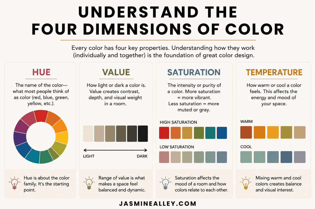
Every color has four major characteristics:
- Hue: The actual color family, such as red, blue, green, or yellow.
- Value: How light or dark the color is.
- Saturation or chroma: How intense or pure the color is compared to a muted, grayed, or browned version.
- Temperature: Whether the color leans warmer or cooler.
For example, “green” could mean a pale gray-green, a muddy yellow-green olive, or an intensely saturated blue-green emerald. Those greens would play completely different roles in a room.
And of these four characteristics, value is one of the most important.
Imagine converting a beautifully designed room into a black-and-white photograph. If the room still looks interesting, it probably has a strong value structure: light walls, medium-toned upholstery, dark wood, shadows, and small dark accents.
If everything falls within roughly the same light-to-medium value, changing the hues alone won’t necessarily make the room feel finished.
2. Understand the Visual Weight of Color
Colors don’t occupy visual space equally.
As a general guideline:
dark > saturated > warm > light > muted
Dark, saturated, and warm colors tend to attract more attention, while pale and muted colors tend to recede.
This means a tiny burgundy lampshade could visually compete with a much larger oatmeal-colored chair.
It also explains why an otherwise beautiful room filled entirely with pale furniture and soft neutrals can sometimes feel like it’s floating. It may not need more stuff. It may simply need visual weight.
That weight could come from dark wood, bronze, deep green, burgundy, navy, espresso brown, a dark picture frame, or a strongly colored lampshade.
The stronger the color, the less of it you usually need.
3. Think Beyond the 60-30-10 Color Rule
One of the best-known interior design color rules is the 60-30-10 rule: roughly 60% dominant color, 30% secondary color, and 10% accent color.
While for some this is a genuinely useful starting point, I found it confusing… there aren’t just three colors in a room! Fortunately, I don’t think a beautiful room needs to follow those percentages literally.
I prefer to think of a room as having a field, supporting cast, and punctuation.
- Field: The overall atmosphere created by large surfaces like walls, rugs, cabinetry, and major upholstery.
- Supporting cast: The colors appearing in meaningful amounts through wood, curtains, textiles, stone, and furniture.
- Punctuation: Small but visually powerful moments—a red lampshade, cobalt vase, oxblood pillow, or chartreuse ceramic.
The important idea is hierarchy: not every color needs an equal role.
I dive much deeper in this guide to the 60-30-10 color rule, including when I think it works, when I’d ignore it, and how to adapt it for rooms that feel more layered and collected.
4. Create a Color Hierarchy, Not Just a Color Palette
A color palette tells you which colors are present. A color hierarchy tells you what each color is doing.
For example, a palette might be:
Cream + sage + dusty blue + rust + brown.
That’s pretty, but it doesn’t tell us much about the actual room.
A hierarchy might be:
The room is predominantly warm neutral. Green is the main color. Brown grounds the palette. Dusty blue provides cool relief. Red appears in tiny doses as punctuation.
Now we have a design strategy!
When you’re evaluating a room, ask yourself: Which color has the most authority?
Not every color needs equal billing. In fact, giving every color equal importance is often what makes a room feel busy.
5. Mix Warm and Cool Colors
Something I’ve heard over and over again is you should keep a room either all warm or all cool. But it turns out, as I’ve analyzed designers like Heidi Caillier and Beata Heuman, a warm room does not mean everything in the room needs warm undertones.
In fact, doing that can make a room feel overly yellow, muddy, or heavy. Likewise, an entirely cool palette can start feeling sterile.
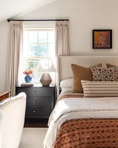
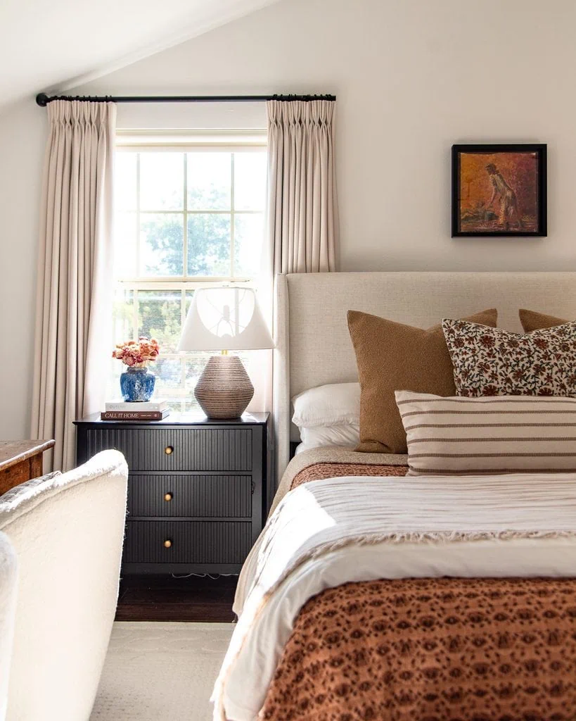
My bedroom leans heavily warm with rust, camel, cream, brown, and warm wood tones, so the little blue vase on my nightstand provides just enough cool contrast to keep the palette from feeling overly warm or one-note.
The thing is, temperature contrast creates depth.
For example:
Warm ivory + caramel wood + rust + brass + dusty blue
That dusty blue gives your eye relief from all that warmth.
Or:
Slate blue + gray + black + walnut + ochre + aged brass
The warm wood and ochre keep the blues from feeling icy.
Think of temperature contrast like seasoning. You don’t necessarily need much of the opposing temperature, but the room is often better because it’s there.
6. Undertones Matter Most When Colors Are Similar
Undertones are incredibly important in interior design, but here’s something that isn’t always explained: the closer two colors are to each other, the more important their undertones become.
A yellow chair and blue pillow obviously aren’t supposed to match.
But put a warm ivory beside a green-white, pink beige, and yellow beige, and suddenly every tiny difference becomes obvious.
This is one reason selecting several whites and beiges can actually be harder than creating a colorful palette.
Similarity demands precision, but contrast gives you freedom.
If you’re trying to match an existing color, either match it convincingly or create enough contrast that the difference looks intentional. A near-match often looks more accidental than two obviously different colors.
7. Use Value to Create Depth
Sophisticated rooms often vary value more than they vary hue.
Instead of filling a room with six equally bright colors, you might have pale buttery cream, medium dusty blue, deep moss, medium rust, dark chocolate, and a tiny touch of cherry red.
There’s plenty of color, but the different light and dark values give the room structure.
You can also use several values of the same hue:
Celadon + sage + olive + forest green
The eye recognizes that these colors belong to the same family, while the variation keeps the room layered.
8. Don’t Be Afraid of Muddy Colors
Some of the most sophisticated interior colors look surprisingly unattractive as isolated digital swatches.
Think dirty mustard, brownish pink, gray-green, tobacco, muddy lavender, brick, putty, olive, ochre, and mushroom.
Muted colors can behave almost like neutrals while still contributing real color to the room.
They’re also incredibly useful because they create a backdrop for cleaner colors.
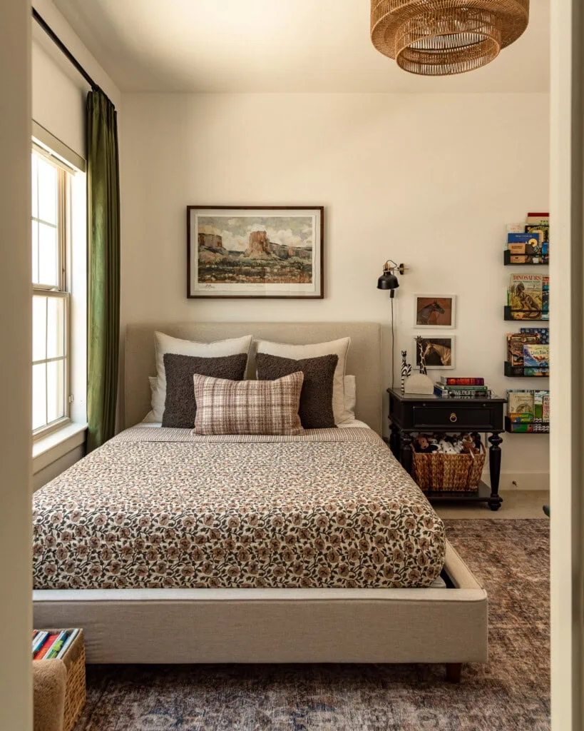
My son’s bedroom is almost entirely built from “muddy” colors like faded brown, chocolate, warm wood, and muted rust. I love how those imperfect, earthy shades layer together almost like neutrals while still giving the room plenty of color.
Also, with these colors:
Faded brown + muted rose + oatmeal + muddy rose + clear olive green
because most of the palette is muted, that clearer green suddenly comes alive.
9. Vary Saturation Levels
Just as every color shouldn’t have the same value, every color doesn’t need the same saturation.
A room where everything is dusty can become lifeless. A room where everything is saturated can become exhausting.
Instead, try combining mostly muted colors with smaller amounts of stronger color.
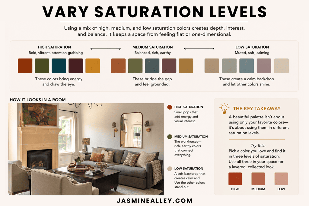
You might think of a room as roughly:
- 80% muted color
- 15% moderately saturated color
- 5% clear color
Those aren’t percentages you need to measure. The point is that unequal saturation creates hierarchy.
A tiny flash of turquoise in a faded antique rug can be more exciting than an entire turquoise sofa.
10. Use Controlled Dissonance to Make a Room Interesting
Here’s where color theory gets really fun.
The most memorable rooms usually contain something that feels just a little unexpected. I think of this as controlled dissonance: introducing a surprising color that creates intentional tension with the rest of the palette.
But the surprise shouldn’t be random. The best unexpected colors often solve something the room is missing.
Imagine cream walls + brown furniture + a tan rug + olive upholstery + brass. It’s beautiful, but very warm and predominantly mid-toned.
Adding powder blue could provide missing temperature. Dark chocolate could provide missing value. A tiny hit of coral red could provide missing saturation.
The surprise works because it’s also corrective.
Add a Temperature Intruder
Create an overwhelmingly warm room and add one cool color: Rust + cream + brown + ochre + icy blue
Add a Saturation Intruder
Create a muted room and add something unexpectedly clear: Sage + dusty rose + oatmeal + brown + cobalt
Add a Hue Intruder
Use mostly neighboring colors and introduce something farther away on the color wheel: Olive + moss + chartreuse + cream + burgundy
Add a Value Intruder
Use a very pale room with one dramatically dark element: Cream + pale blue + linen + espresso
Add Something Unexpectedly Sweet
An earthy, serious palette can become much more interesting with something delicate: Olive + tobacco + brown + ochre + shell pink
Add an “Ugly” Color
This is one of my favorites when it’s done well! Take an objectively beautiful palette and introduce something slightly questionable: Dusty blue + cream + mahogany + florals + acid yellow-green
That weird little color might be exactly what keeps the room from feeling too precious.
11. Use Complementary Colors, But Make Them Imperfect
Traditional complementary colors sit opposite each other on the color wheel: red and green, blue and orange, yellow and purple.
But using the pure versions can feel a little elementary.
Instead, bend those complementary relationships toward brown and gray.
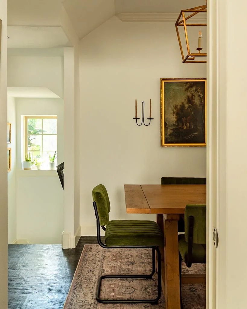
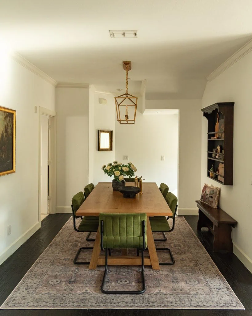
My dining room uses this same idea with olive green chairs and a faded mauve rug. They’re softened versions of the red-green complementary relationship, so there’s enough contrast to make the palette interesting without the colors feeling obviously complementary.
Think burgundy + olive instead of Christmas red + green, dusty blue + tobacco instead of bright blue + orange, or mustard + plum instead of primary yellow + purple.
You’re still benefiting from the tension of complementary colors, but the palette feels much more nuanced.
12. Use Analogous Colors for Richness
Analogous colors sit beside one another on the color wheel.
For example, yellow → yellow-green → green could translate into an interior palette of:
Ochre + mustard + olive + moss + sage
Because the colors are related, the room feels harmonious and enveloping.
Then introduce one color from farther away on the color wheel—perhaps dusty lavender.
One of the easiest formulas for an interesting interior palette is:
3–4 neighboring colors + 1 outsider.
13. Repeat Colors Without Making Everything Match
You’ve probably heard the rule that you should repeat every color three times around a room.
There’s some truth to it, but don’t take it too literally.
You don’t need three identical green objects. Instead, create a color echo.
For example:
Green velvet chair → green leaf in artwork → olive stripe in a pillow → green ceramic
The colors aren’t identical, but your eye recognizes the relationship. It makes green feel like it belongs in the room without making the decorating look overly coordinated.
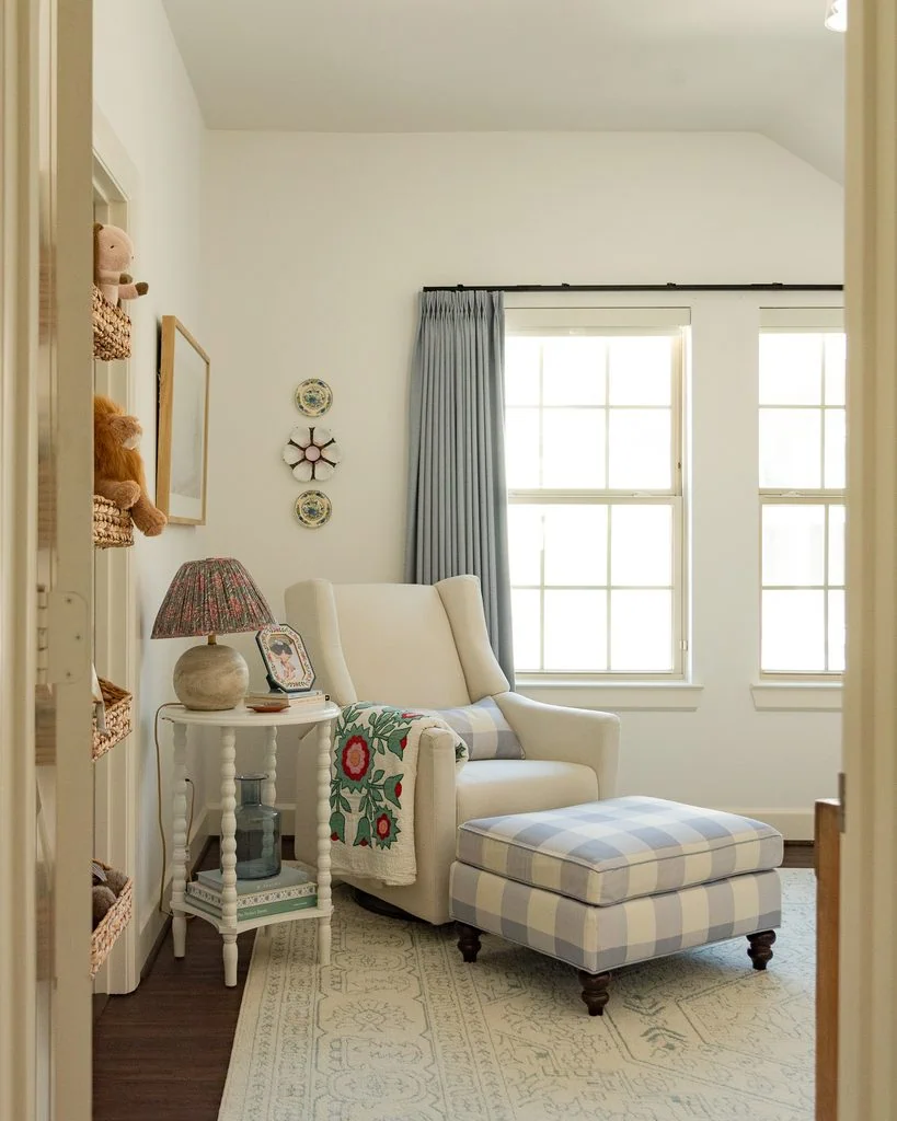
In my daughter’s nursery, I repeated dusty blue across the curtains, gingham ottoman + pillow, and rug without trying to match the shades exactly. Those subtle color echoes make the palette feel intentional without making the room feel overly coordinated.
14. Know the Difference Between Motif and Punctuation Colors
Not every color needs to be repeated.
I like separating colors into motif colors and punctuation colors.
A motif color travels around the room. Green might appear in upholstery, art, textiles, ceramics, and a rug.
A punctuation color can appear only once or twice. Maybe it’s a cherry-red lampshade, cobalt bowl, or yellow picture frame.
And no, you don’t always need to “tie it in” somewhere else.
Sometimes repeating the unexpected color too many times actually weakens it. Instead of being an exciting surprise, it becomes your designated “accent color.”
15. Distribute Visual Weight Around the Room
Color has visual mass.
If all the darkest colors in a room are clustered on one side, the room can actually feel visually lopsided.
Try squinting when you look at your room. Ignore what the individual objects are and notice where you see dark masses, light masses, saturated color, and empty areas.
Ask yourself:
- Is all the visual weight near the floor?
- Is one side considerably darker than the other?
- Does my eye keep getting stuck in one place?
Sometimes adding a dark frame, curtain rod, lamp, or piece of art on the opposite side of the room can fix something that previously felt “off.”
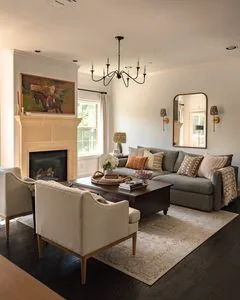
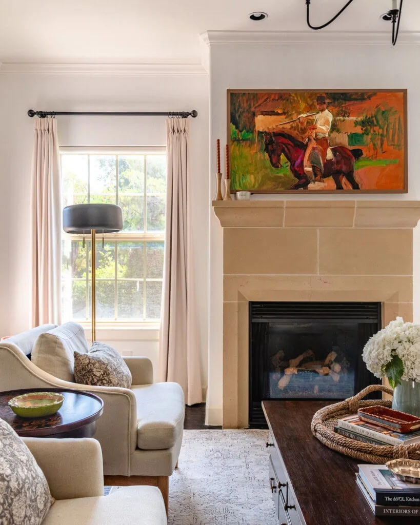
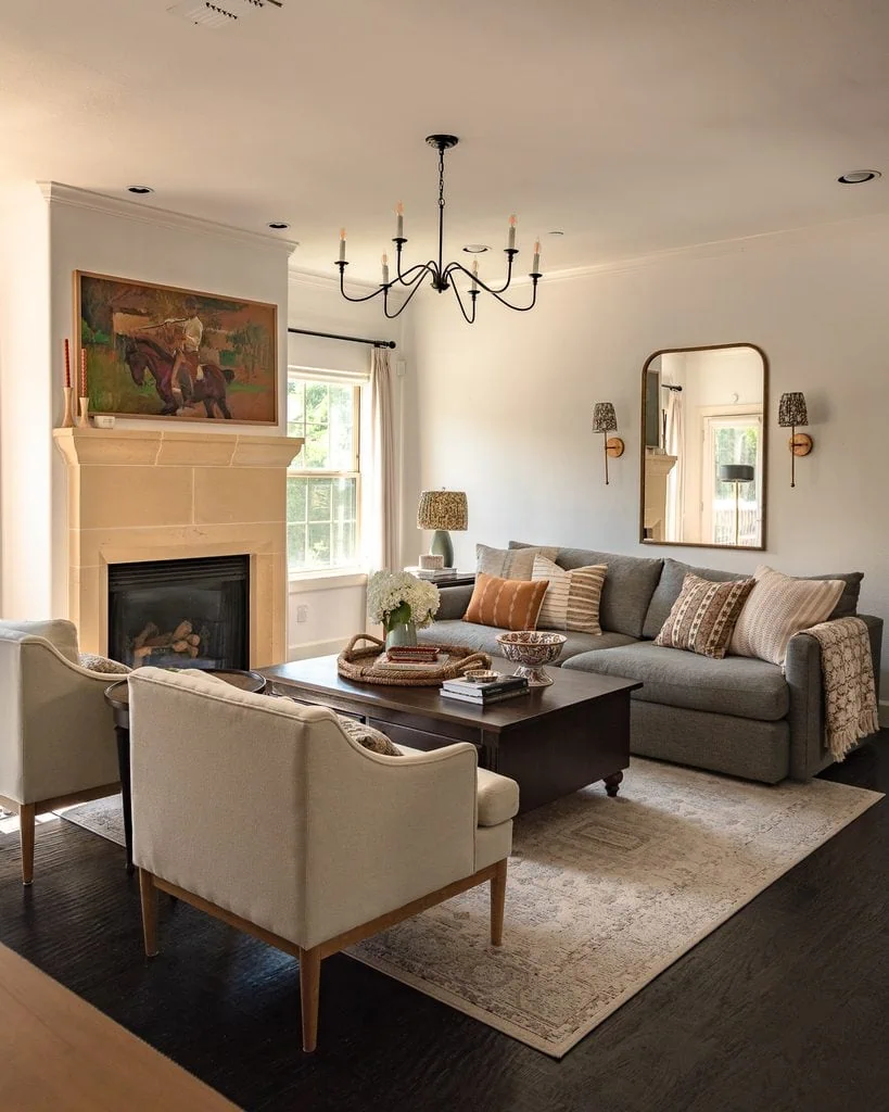
In my living room, the dark wood floors and coffee table ground all of the lighter upholstery, while the black chandelier and curtain rods carry some of that visual weight upward and the colorful painting keeps the fireplace side of the room from feeling too light.
16. Consider Where Color Appears Vertically
Where color appears in a room changes how we experience it.
- Dark color near the floor tends to feel grounding.
- Color at eye level becomes prominent.
- Color overhead can make a room feel enveloping.
For example:
- Dark rug + pale ceiling = grounded. (I used to dislike the black floors that came with my home until I started experimenting with color theory!)
- Dark ceiling + lighter floor = enveloping and dramatic.
- Colorful upholstery = energetic.
- Colorful art + neutral furnishings = expressive without allowing color to dominate the architecture (like the colorful art we chose for above our fireplace).
This is especially helpful when deciding whether to paint ceilings, trim, doors, or millwork.
17. Remember That Wood Is a Color
Wood isn’t a neutral absence of color.
Walnut is brown. Mahogany can contribute red. White oak may contribute yellow. Some antique oak reads distinctly orange. Espresso wood can function almost like black.
So if you have green walls, pink upholstery, blue curtains, and mahogany furniture, you don’t really have a three-color palette. You have at least four.
Always include your wood tones when evaluating a room’s color palette.
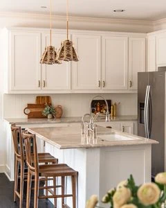
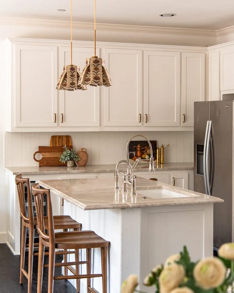
My kitchen is a good reminder that wood counts as color: against the quiet cream cabinetry and stone countertops, the warm brown counter stools and cutting boards become a major part of the palette, adding the warmth and contrast the room needs.
Read about our Taj Mahal quartzite kitchen renovation decisions and costs here!
18. Metal Is a Color, Too
The same applies to metal finishes.
- Polished nickel: cool, bright, reflective
- Brass: warm and yellow
- Antique brass: muted ochre/brown
- Bronze: deep brown to nearly black
- Chrome: crisp, cool gray
This is also why metals don’t necessarily need to match perfectly throughout a room. Sometimes introducing a different metal temperature can actually help balance the palette.
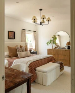
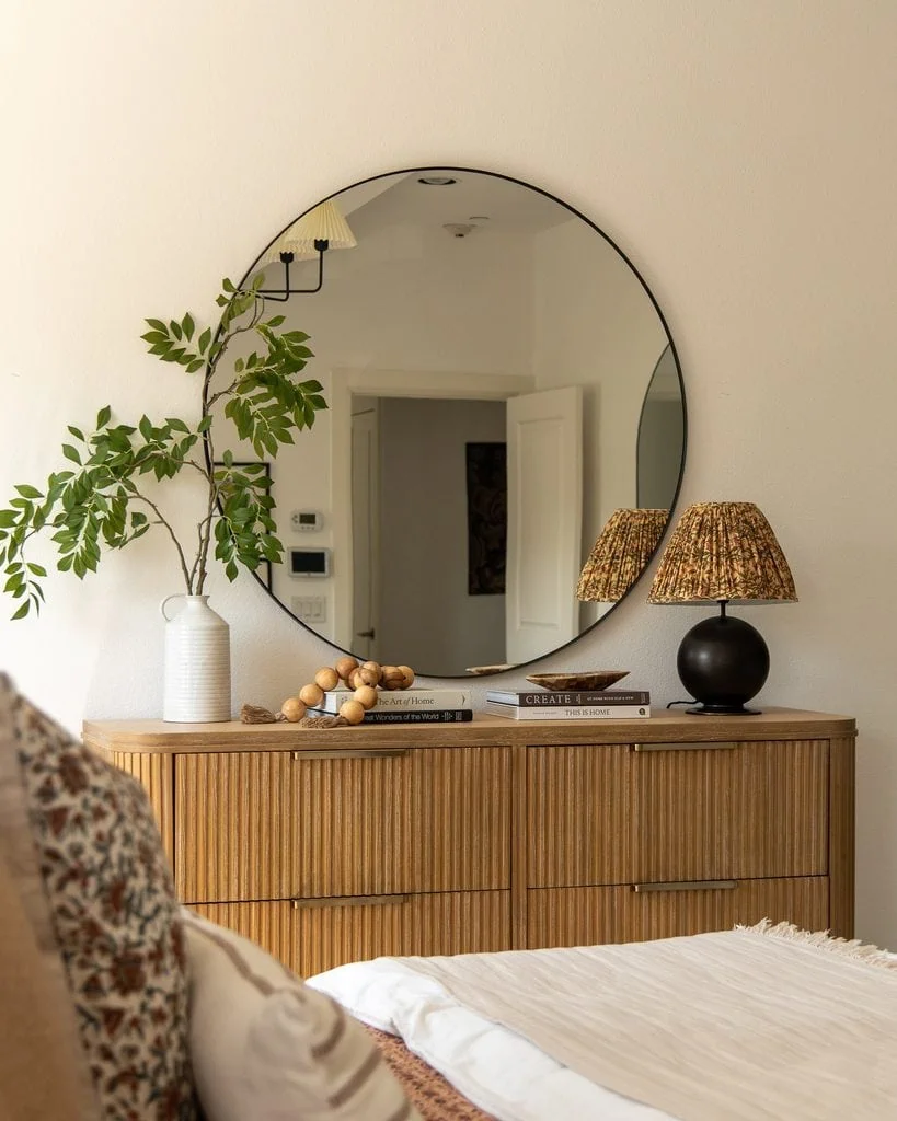
In my bedroom, the dark bronze lamp and black mirror frame act almost like a color themselves, adding a deep, cool visual note against the warm oak dresser, brass hardware, and earthy patterned shade.
19. Use Pattern as a Color-Delivery System
Pattern is one of the easiest ways to introduce several colors without making a room feel disjointed.
Suppose you want to combine blue + green + rust + pink.
As four separate solid-colored objects, the combination might feel forced. But put those colors together in an antique rug or floral fabric and suddenly the relationship makes sense.
The pattern essentially gives your eye evidence that the colors belong together. Then you can pull individual colors from that pattern elsewhere in the room.
This is why rugs, textiles, wallpaper, and artwork are such useful starting points for an interior color palette!
20. Don’t Pull Every Color From Your Pattern
Here’s the flip side.
Say your floral fabric contains blue + red + green + yellow + cream.
You don’t need a blue pillow, red lamp, green chair, yellow throw, and cream curtains. At that point, the room starts looking like the fabric exploded.
Instead, pull one or two colors strongly. Allow some of the others to exist primarily within the pattern, then consider introducing a color that isn’t in the fabric at all. The result usually feels much more collected.
21. Remember That Material Changes Color
The same hue looks completely different depending on the material.
Forest green in velvet won’t behave like forest green on painted drywall.
Think about the difference between velvet, linen, lacquer, matte paint, ceramic glaze, and glass.
Velvet creates shadow and depth. Linen softens color. Gloss makes it more intense and reflective. Matte finishes absorb light. Glass can make color feel luminous.
This means you can repeat approximately the same color throughout a room without it feeling repetitive if you vary the material and texture.
22. Treat Light as Part of Your Color Palette
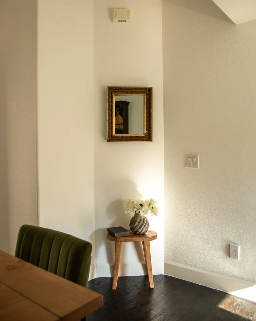
A paint color doesn’t really have one single appearance. It has a range of potential colors activated by light.
Cool morning light may reveal more blue, green, gray, or violet. Warm western afternoon light may emphasize yellow, peach, or brown. Warm artificial lighting can shift colors again after sunset.
So instead of asking “what color is this paint?” a more useful question is “what colors can this paint become in this room?”
Always test paint, fabric, and major finishes in the actual room and look at them throughout the day before committing.
23. Understand That “Neutral” Is Relative
There really isn’t such a thing as a completely neutral neutral.
Put beige next to yellow and it may suddenly look gray. Put the same beige next to gray and it may look pink. Put it beside pink and it might suddenly appear greenish.
Color perception is comparative.
This is one reason a paint color can look completely different in your house than it did in the store—or even completely different from one room to another.
24. Use Simultaneous Contrast to Your Advantage

Put gray-green beside pink and the green may look greener while the pink looks pinker. Put blue beside orange and both colors become more noticeable. Put cream next to pure white and the cream suddenly appears much yellower.
I love how this plays out with the vintage paintings on my stairway: against the warm cream walls and gold frames, the blue-greens and greens look noticeably cooler and more vivid, while the ochre and orange tones blend more naturally into their surroundings.
This is called simultaneous contrast.
It explains why things such as trim color matter so much. You’re never selecting a wall color in isolation. You’re selecting wall color relative to trim color.
The same applies to cabinets beside countertops, upholstery beside rugs, and wallpaper beside millwork.
25. Stop Asking, “Does This Match?”
When you’re deciding whether a piece of furniture, art, textile, or antique works in a room, “Does it match?” isn’t the most helpful question.
Instead, ask:
- What color does this repeat?
- What does it contrast with?
- What temperature does it add?
- What value does it add?
- Does the room already have something doing this job?
That final question is especially useful.
Maybe your room doesn’t need another beautiful medium-toned object. Maybe it needs darkness. Maybe it needs coolness. Maybe it needs one tiny shot of saturated color.
Thinking about what the room is missing is much more useful than trying to make everything match.
26. Don’t Make Every Beautiful Object Cooperate
One of the differences between a room that feels “decorated” and one that feels collected is how perfectly everything cooperates.
A decorated room can sometimes look like every object was purchased specifically to fit the color palette.
A collected room leaves room for the odd piece.
Maybe there’s a strange little antique painting or an unexpectedly colored ceramic that doesn’t quite “match.” Those pieces add personality and make the room feel as though it evolved over time.
This is especially helpful when you’re dealing with a difficult space. Instead of fighting every quirk, sometimes it’s better to lean into it. I used a similar approach when figuring out how to style an odd shaped bedroom: work with what makes the room unusual instead of trying to force it into a perfectly conventional formula.
27. Use Brown as a Color Mediator
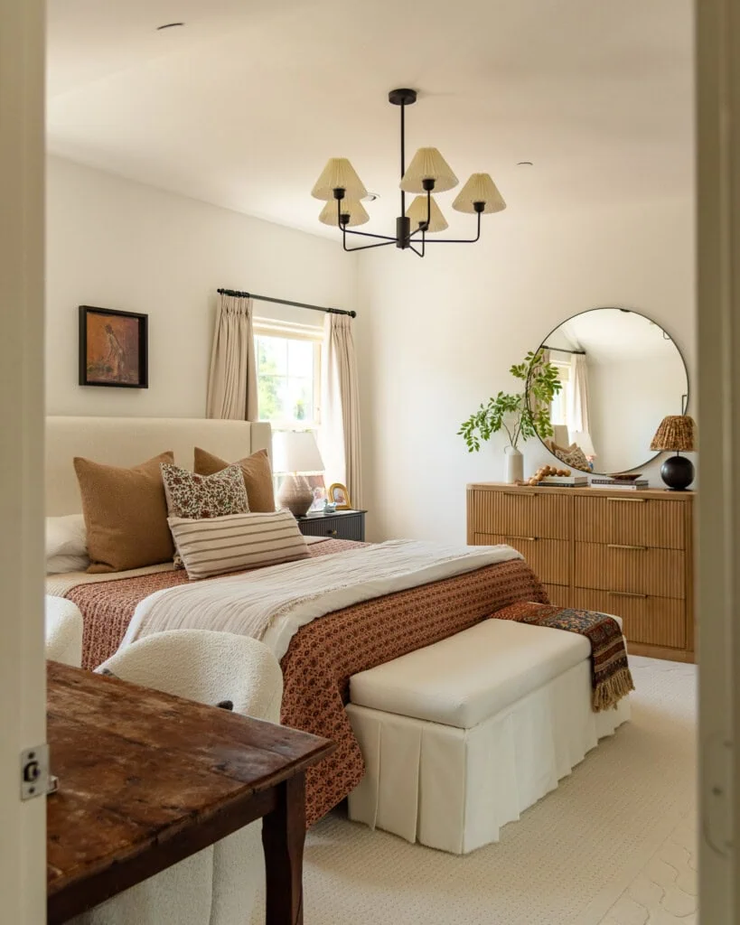
Brown is one of the most useful colors in interior design because it can bridge colors that might otherwise feel unrelated.
Pink + blue can feel sweet. Add walnut:
Pink + blue + walnut
and suddenly the combination feels more grounded.
Green + purple might feel eccentric. Add tobacco brown and cream:
Green + purple + tobacco + cream
and it starts feeling historical and sophisticated.
This is one reason antique wood furniture works so beautifully in colorful rooms. Brown creates visual gravity.
My bedroom is a great example of how I use brown as a mediator: the antique wood, tobacco-colored pillows, rust bedding, and woven textures bridge the cream, black, blue, and patterned elements so the whole palette feels layered rather than disconnected.
28. Add a Little Red
You’ve probably heard of the “unexpected red theory,” the idea that adding something red to a room can make the entire space look better even when red isn’t part of the obvious color palette.
It’s not a hard-and-fast rule of color theory, but the underlying concept makes sense: red has enormous visual weight.
A tiny amount of tomato red, brick, coral, oxblood, or cherry can wake up a palette of blue, green, brown, and cream.
The best part? It doesn’t necessarily need to match anything.
A tiny red object can function like a period at the end of a sentence.
29. Remember That Black Isn’t the Only Way to Add Contrast
You’ll sometimes hear that “every room needs black.”
I don’t think every room literally needs black.
What many rooms do benefit from is something sufficiently dark to create contrast and anchor the lighter colors.
That could be espresso, aubergine, forest green, oxblood, navy, charcoal, or bronze.
Deep chromatic colors can perform the visual job of black while contributing even more richness to the palette.
30. Try the “One Wrong Thing” Rule
Noticing my favorite designers do this has changed how I think about designing my own home. I’ve seen Heidi Caillier put electric red in a largely blue and green room. Ben Pentreath has placed magenta lampshades in a calm Cornish castle drawing room.
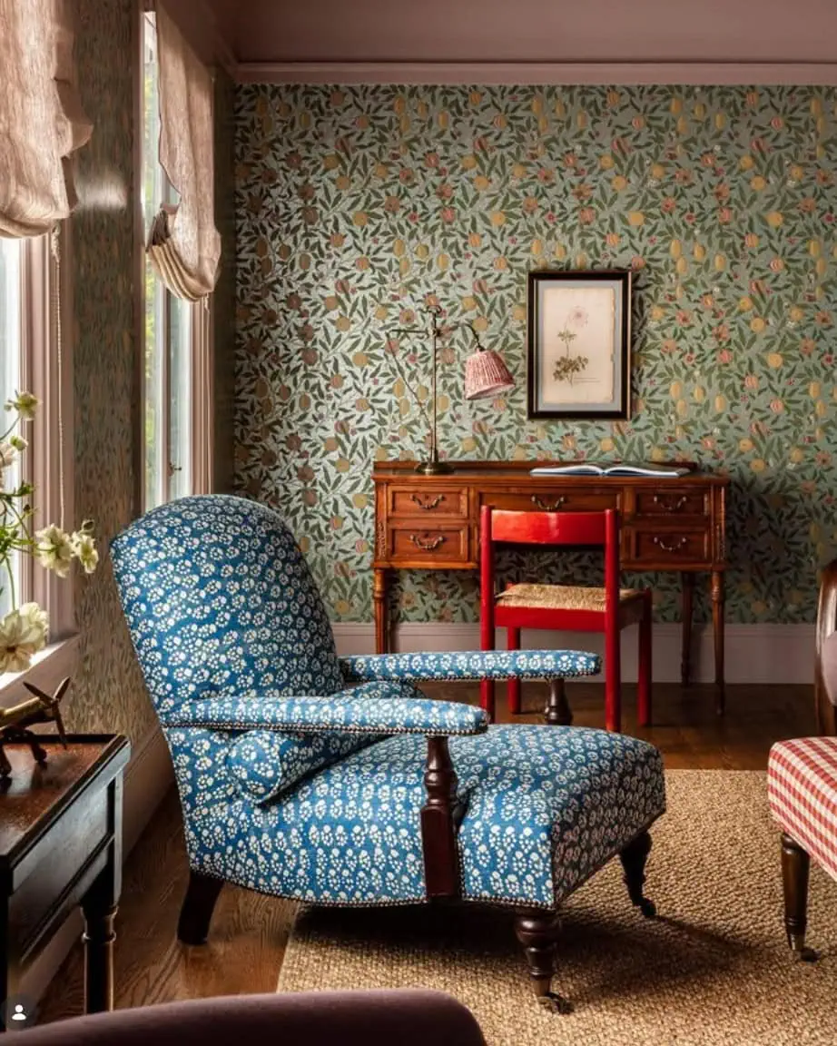
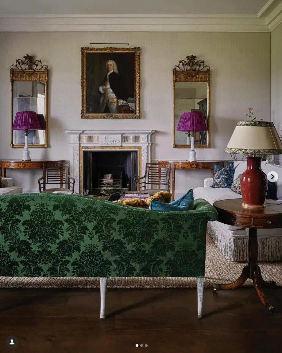
Once a room feels about 90% finished, look for the most predictable color choice and try replacing it with something one notch stranger.
- Instead of a sage lampshade, try ochre
- Perhaps instead of a cream pillow, try faded lavender
- Instead of a brown frame, try tomato red
- How about instead of blue-and-white pottery, try chartreuse
You don’t automatically need to choose the weird option… just test it.
You’re looking for the moment where your reaction changes from “that’s pretty” to “wait… why is THAT so good?” That’s often where the most interesting design begins!
I think of every room as having a dissonance budget. The more complicated the architecture, patterns, and major furnishings already are, the smaller your surprising color moments may need to be.
If the room’s foundation is restrained, you have much more freedom to make an eccentric color choice.
In other words, order gives you permission for weirdness. The stronger the underlying structure of a room, the more eccentricity it can usually handle.
31. Describe the Color You Need Without Naming a Hue
Here’s a more advanced trick.
Instead of saying “this room needs green,” try saying “this room needs a medium-dark, muted, slightly cool chromatic color.”
Now green isn’t your only option.
You might try dusty teal, slate blue, aubergine, forest green, or deep lavender.
This forces you to think about the job the color needs to perform instead of immediately choosing a familiar hue.
32. Balance Harmony and Tension
If there’s one color theory rule I want you to take away from this entire guide, it’s this:
Harmony isn’t the absence of conflict.
The most interesting interior color schemes contain both harmony and tension.
Harmony Comes From:
- Repetition
- Related undertones
- Analogous colors
- Similar saturation levels
- Colors shared within patterns
- Repeated materials and wood tones
Tension Comes From:
- Complementary colors
- Warm/cool contrast
- Unexpected saturation
- Very dark values
- One-off colors
- Slightly “ugly” colors
Too much harmony and a room can become bland. But too much tension and it becomes chaotic. The magic is somewhere in between.
How Do You Choose a Color Palette for a Room?
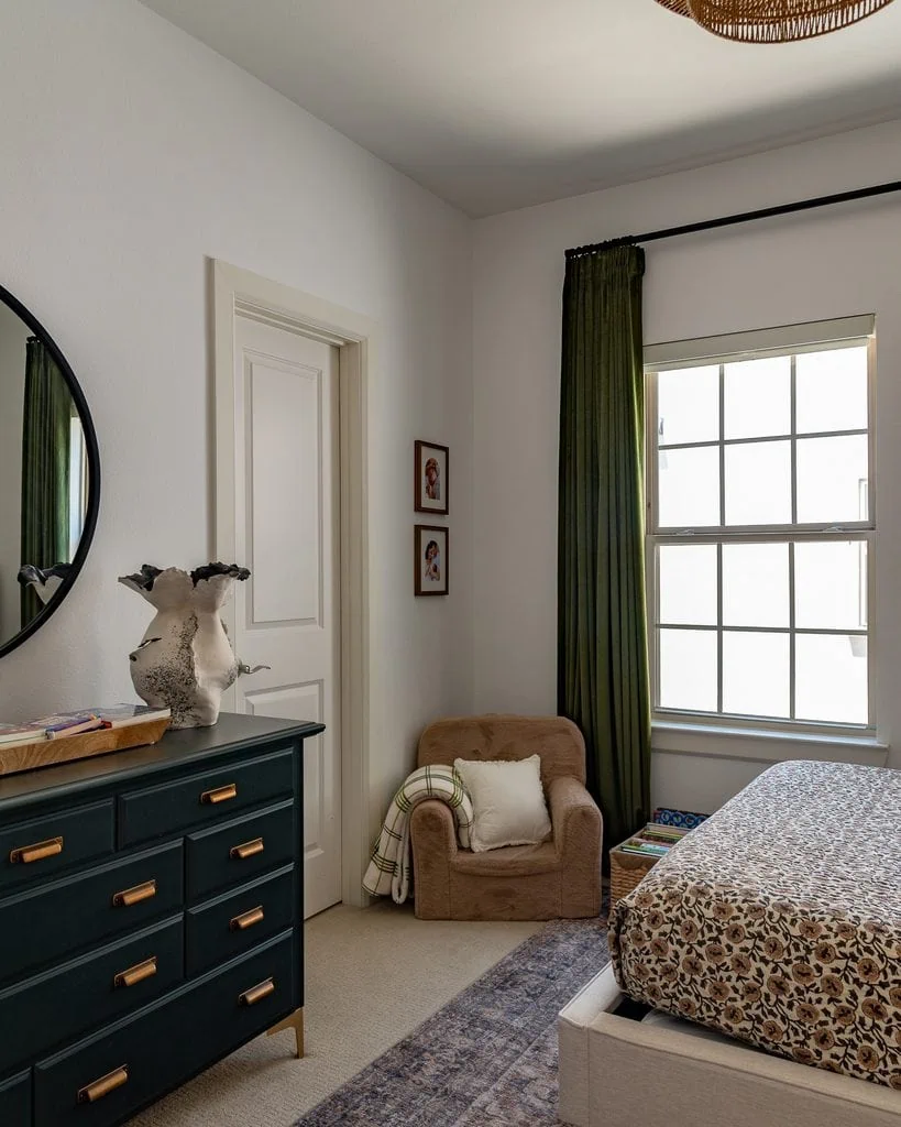
If you’re staring at a room and have absolutely no idea where to begin, don’t start by picking five paint swatches.
Start with what’s already there.
Flooring, wood, stone, cabinetry, major upholstery, and other permanent finishes already count as colors. From there, you can establish the room’s value structure, decide whether the overall atmosphere should skew warm or cool, choose a primary color family, and eventually add the smaller contrasting and punctuation colors.
The biggest mistake is trying to choose every color at once before understanding what the room already needs.
I’ll be covering this process step-by-step in a separate guide to choosing an interior color palette, including how to work from existing finishes and how to choose colors that flow from room to room.
What Colors Go Well Together in Interior Design?
There isn’t one universal list of colors that “go together” in interior design because the answer changes depending on each color’s undertone, value, saturation, temperature, material, lighting, and proportion.
But there are a few combinations that show how these principles work:
- Olive + burgundy + cream: muted complementary contrast
- Dusty blue + tobacco + ivory: cool/warm balance
- Plum + mustard + walnut: sophisticated yellow-purple relationship
- Muddy pink + olive + brown: soft complementary tension
- Cream + chocolate + cobalt: neutral foundation with saturated punctuation
The important thing isn’t simply copying a combination. It’s understanding why it works and how much of each color you’re using.
An entire tomato-red sofa and a tiny tomato-red lamp aren’t equivalent design decisions.
I’ll also be creating individual color-pairing guides that go much deeper into specific colors—looking at the best neutrals, contrasting colors, wood tones, metals, unexpected combinations, and room applications for each one.
How Does Color Theory Change From Room to Room?
The basic principles of color theory stay the same, but the way I’d apply them can change quite a bit depending on the room.
A living room usually has many different materials competing for attention: upholstery, rugs, wood furniture, window treatments, art, lighting, and accessories. A kitchen has much larger permanent color blocks from cabinetry, countertops, flooring, and backsplash. Bedrooms can usually tolerate softer value contrast, while powder bathrooms are often great “jewel box” rooms to experiment with more concentrated color.
So rather than looking for one “perfect whole-house palette,” think about creating a relationship between rooms while still allowing each space to have its own color hierarchy.
You can see how colors change from room to room in my home tour where I analyze modern traditional interior design within my Dallas townhouse.
Color Theory Interior Design FAQs
What is color theory in interior design?
Color theory in interior design is the study of how colors interact and how characteristics like hue, value, saturation, temperature, proportion, and contrast affect the appearance and mood of a room. Designers use these relationships to create color palettes that feel balanced, layered, and intentional.
What is the 60-30-10 rule in interior design?
The 60-30-10 rule suggests using approximately 60% of a dominant color, 30% of a secondary color, and 10% of an accent color. It’s a helpful starting point, but it isn’t a requirement. Color hierarchy, value, visual weight, and contrast can be more useful than following exact percentages.
What is the most important element of color theory in interior design?
Value—how light or dark a color is—is one of the most important and overlooked elements of interior design color theory. A room with strong light, medium, and dark values can feel visually balanced even when it contains many different hues.
How many colors should you use in a room?
There’s no fixed maximum number of colors you can successfully use in a room. A colorful room can still feel cohesive when the colors have a clear hierarchy and vary in visual weight, value, and saturation. Not every color needs to appear in equal amounts.
Should every color in a room be repeated?
No. Major motif colors often benefit from repetition, but punctuation colors can be effective precisely because they appear only once or twice. Repeating every accent color can actually make a room feel overly coordinated.
Do warm and cool colors work together?
Yes. Mixing warm and cool colors is one of the best ways to create depth in an interior. A predominantly warm room often benefits from a smaller amount of cool color, while cool rooms can feel more inviting with warm wood, brass, rust, ochre, or similar elements.
How do I know what color my room is missing?
Instead of immediately looking for a specific hue, identify what’s missing in terms of value, temperature, and saturation. A pale, warm, muted room might need something dark, cool, or more saturated rather than simply “another color.”
Do wood and metal count as colors in interior design?
Absolutely. Wood can contribute brown, yellow, orange, red, or nearly black tones, while metals contribute warm or cool color as well as reflectivity. Both should be considered part of an interior color palette.
What is the unexpected red theory?
The unexpected red theory is the idea that a small red element can improve a room even when red isn’t an obvious part of its color palette. While it’s not a formal rule of color theory, red has strong visual weight, which makes small amounts of tomato, brick, cherry, coral, or oxblood particularly effective as punctuation colors.
Final Thoughts on Color Theory in Interior Design
The biggest thing I’ve learned about using color in interior design is that great color isn’t about making everything match.
It’s about creating relationships:
- Light against dark
- Warm against cool
- Muted against saturated
- Repetition against surprise
- Harmony against tension
Once you stop asking, “Does this color match my room?” and start asking, “What is this color doing for my room?” you begin seeing color completely differently.
And that’s where decorating gets really fun!
A room doesn’t need a perfectly coordinated palette. It needs structure, hierarchy, balance—and ideally one little color choice that makes you wonder why on earth it works so well.
Happy designing!
Jasmine